
Munchy

Role: UX/UI Designer
How can design drive deeper engagement in food apps beyond reviews and ratings?
This case study details my UX/UI process in creating Munchy, a platform that transforms food discovery into a social and visual journey, rooted in shared tastes and real recommendations.
From Cravings to Convenience: Designing Munchy
Overview
Munchy is a food discovery app developed as a dedicated platform for food enthusiasts to share food photography, connect with like-minded users, and receive personalized restaurant recommendations based on their food interests.
The Problem
Solution
With countless dining options available, many people feel overwhelmed when deciding where to eat. While platforms like TikTok and Instagram offer inspiration, they often lack personalization and can still leave users feeling indecisive.
There’s a need for a dedicated space where food lovers can easily discover trusted recommendations, share their favorite restaurants, and connect with others who share their food interests.
By introducing Munchy, the app highlights personalized restaurant recommendations, eliminating the need to rely on social media content to find new restaurants. Munchy ensures users can quickly discover restaurants they’ll actually enjoy, while keeping food inspiration, trusted recommendations, and community engagement seamlessly in one place.
Insights That Guided Munchy
Competitive Analysis, User Research & Personas
Analysis
To begin the process of designing Munchy, a competitive analysis of similar platforms revealed the following gaps and paint points:::
1. More Personalized Food Discovery Experience: Users often feel overwhelmed by the amount of generic recommendations on existing platforms. Popular food discovery apps tend to promote trending or sponsored content rather than tailoring suggestions based on individual preferences, dietary restrictions, or past behavior.
2. Dedicated Space to Share Food Content: While users frequently engage in taking photos of meals and writing reviews, most platforms do not offer a dedicated community-driven space where users can actively share and discuss their food experiences.
3. Lack of Trustworthy Reviews: Many food apps rely on star ratings or unverified reviews, which often lack depth or relevance. Users may find it hard to trust vague or outdated feedback especially when it doesn’t match their own priorities (food quality, ambience, service). Reviews can also be biased, sponsored, or written by users with very different expectations, making it difficult to make confident decisions.
User Research
The goal for the user research was to better understand users’ needs, behaviors and pain points for discovering new restaurants and sharing food content. I conducted user interviews with five individuals who regularly go out to eat and enjoy sharing food content online.
Questions were asked to better understand users’:
1. Motivation to share food photography and content online
2. Process to find new restaurants
3. Challenges faced when searching for new restaurants

Affinity Map
After conducting user interviews, I organized the responses into an affinity map to find user insights.
Users repeatedly mentioned their need for casual content, trustworthy reviews for validation and TikTok as their main tool for restaurant discovery.
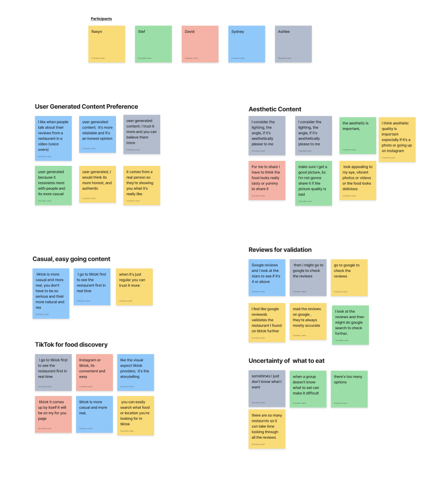
User Insights
1. User Generated & the Preference for “Casual Content”
Users trust and prefer user-generated content over professional photos for food, because it feels more authentic and relatable. TikTok is often used to find new food, it has the casual, easy-going experience for finding restaurants and food trends that users value
2. Uncertainty of where to eat
Users find they are often unsure of what to eat even after searching and find the process occasionally overwhelming due to the amount of food options
3. Personalized Recommendations
Users enjoy receiving personalized restaurant recommendations or guides, especially when they're unsure about where or what to eat, either alone or in groups.
4. Reviews for Validation
After finding restaurants on social media, users often cross-check Google reviews for more validation and the star rating.
In Summary
This research revealed that users crave authenticity, simplicity, and guidance in the food discovery process. As I move forward, I focused on designing an experience that felt casual and trustworthy, while offering personalized, easy-going recommendations.
Personas
Two user personas, Chris and Melanie, were created based on interview insights to better understand the different mindsets around food discovery:
1. Chris doesn’t like to spend a lot of time scrolling through reviews and menus.
He also feels unsure if the reviews he reads are authentic and trustworthy.
As someone with a busy schedule, he values efficiency and wants a reliable way to find great restaurants without the stress of endless searching.

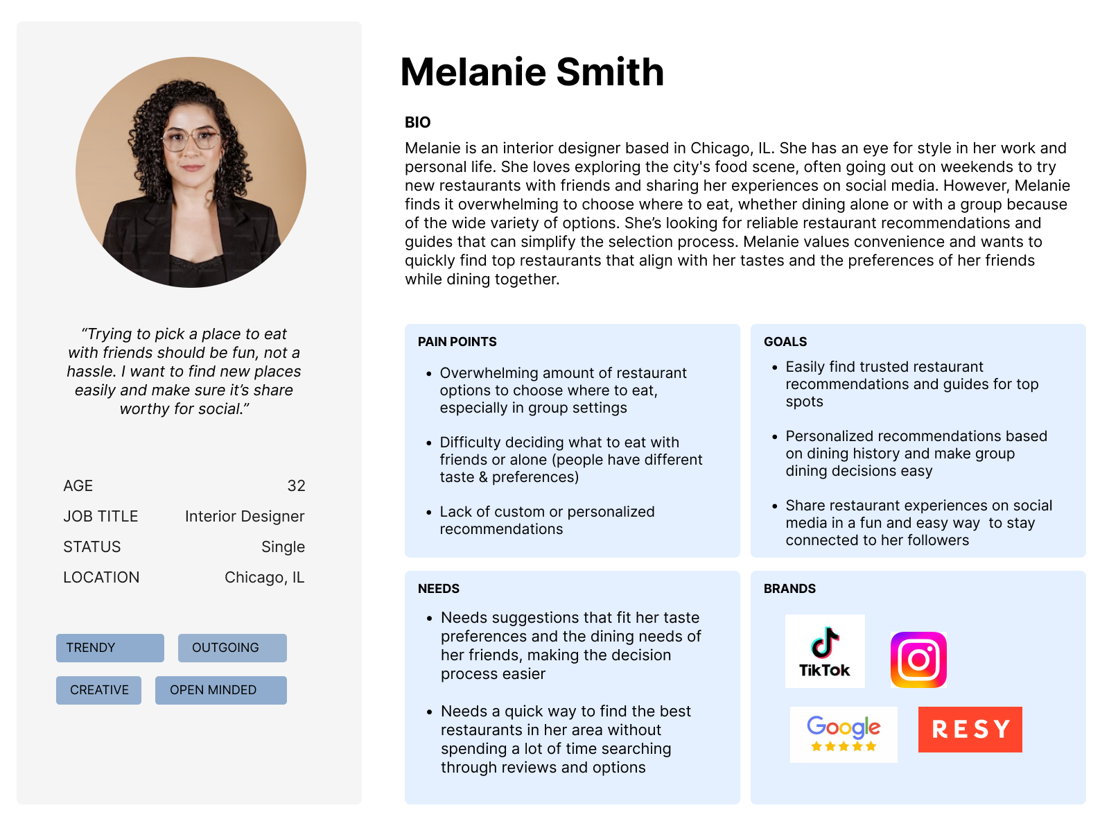
2. Melanie feels overwhelmed by the wide variety of restaurant options and wants reliable recommendations to simplify the decision.
She values convenience and looks for quick, trustworthy picks that suit both her taste and her friend groups.
Turning Insights into Journeys
User Flows & Information Architecture
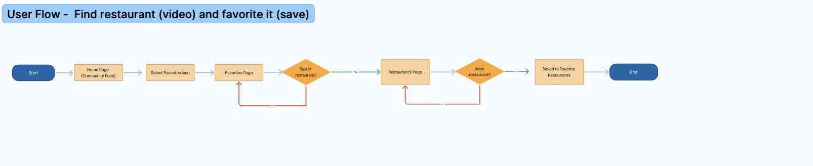
User Flows
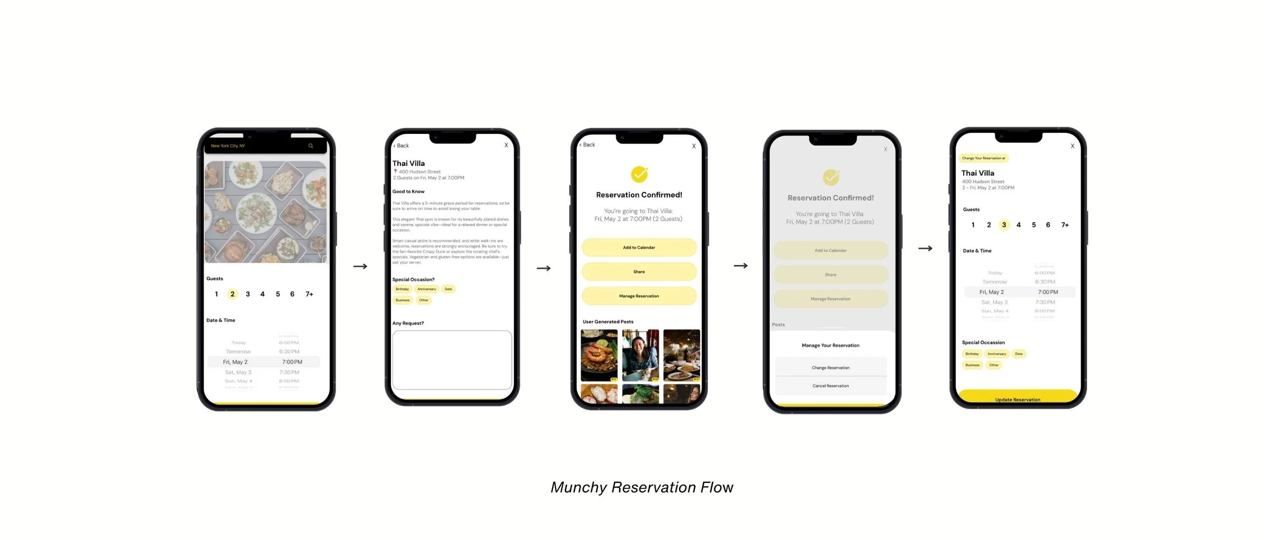
Before designing individual screens, I created user flows to map out key interactions based on the needs of each persona. One of the user flow I focused on was for users to search for a restaurant within the Munchy app, and make a reservation.

Sitemap

Focusing on the app's structural hierarchy, I developed the sitemap for the Munchy app. The sitemap organizes the navigation bar with icons representing top-rated restaurants, the user profile, and the inbox.
Crafting the Voice: Giving Muchy Personality
Moodboard, Branding & Style Guide
Moodboard
Munchy is designed to help users share food photography, connect with like-minded food lovers, and receive personalized restaurant recommendations. The moodboard reflects the app’s core experience: fun, modern, stress-free food exploration and memorable social moments.

Style Guide
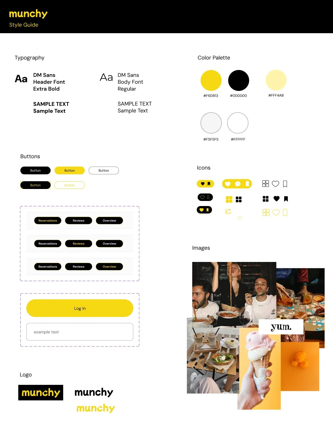
The style guide became an essential document to organize the color palette, logo, typography, and overall aesthetic. I chose the bold use of black and yellow to reinforce Munchy's playful yet modern personality.
Framing the Flow
Wireframing
Low to Mid Fidelity
I sketched low-fidelity wireframes to explore layout options for Munchy's key screens. My focus was on creating it to be clean and intuitive to support the app’s main functions.
I started by focusing on designing low to mid fidelity wireframes for the:
1. Log in / Sign up flow
2. Profile page
3. Explore pages
4. Reservation flow


High Fidelity Wireframes

Building on the mid-fidelity designs, I created high-fidelity wireframes to finalize the visual design, UI components, and overall user experience.


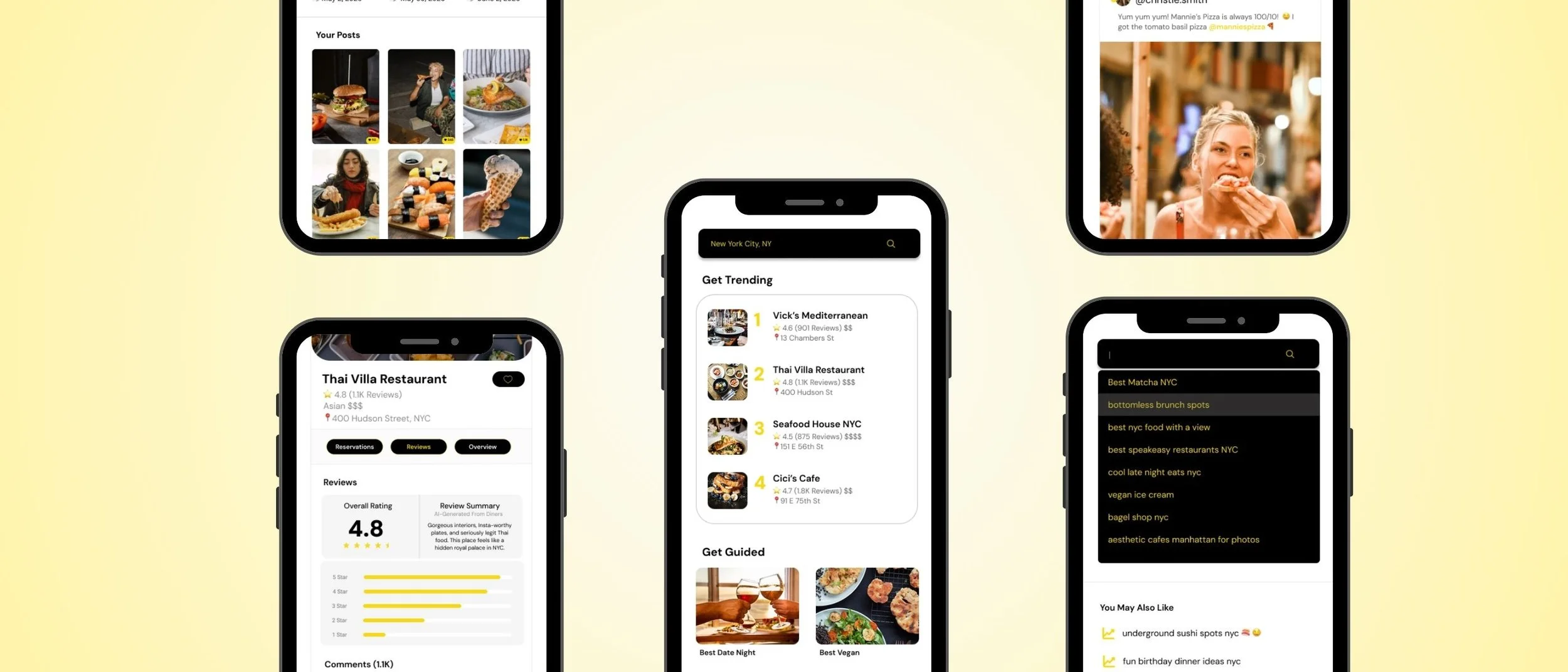
Explore Feed & Reservation
The explore page allows users to browse three distinct feeds: a public “Explore” feed, a “Near You” feed based on location, and a “Friends” feed for social discovery.
The reservation flow remained primarily consistent from mid- to high-fidelity. I focused on keeping the process clear and straightforward to ensure a smooth, user-friendly experience.

Log In & Profile Page
The login page was designed for simplicity, featuring a toggle bar that allows users to switch between log in and sign up without needing to click a separate button to create an account.
The profile page remained consistent from mid- to high-fidelity, with the addition of a search bar at the top to enhance convenience and usability.
Testing the Experience
Prototyping & User Testing
Usability Test
To test the design, five remote usability tests were completed using the updated high-fidelity clickable prototype in Figma. The test focused on the ability for users to:
1. Easily Sign In or Create an Account
2. View Home, Profile & Search Pages
3. Select a Restaurant, Make & Cancel a Reservation
Results from the test prompted some of the following modifications:

Sign In or Create an Account
Users found the login and sign-up process clear and appreciated the option to sign in with Google or Facebook. One user suggested adding text to make the third-party login options even more understandable.
Modification: Added the text “or continue with” above the Facebook/Google options for clarity

View Home, Profile and Search Pages
Users found the app easy to navigate and intuitive, especially appreciating the placement of their reservations on the profile page. Suggestions included adding the comment section into the home feed.
Modification: Added a page to view the comments on a post
Bringing Insights to Life
Final Design
Prototype
The Munchy prototype showcases the app’s core functionality, enabling users to experience intuitive navigation, explore personalized food recommendations, and engage with their community through interactive features.

Munchy Prototype
Munchy is an app that transforms food discovery into a social and visual journey, rooted in shared tastes and real recommendations.
Final Thoughts
While designing Munchy, I learned how important engagement and social interaction are in the food discovery process.
Usability testing showed users were especially interested in the comment feature, emphasizing how much they value shared opinions and community-driven content when deciding where to eat.
This emphasized the value of designing for both function and connection, and pointed to future opportunities to enhance social features for a more collaborative experience in the food space.
